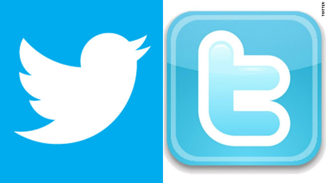
Twitter is giving users the bird. A cute, little, upwardly mobile bird.
The social-networking company wants to be universally known by a new streamlined bird logo, replacing the scruffier bird that had symbolized Twitter since ... well, way back in 2010.
"Starting today you'll begin to notice a simplified Twitter bird," Twitter said in a blog post Wednesday. "From now on, this bird will be the universally recognizable symbol of Twitter. (Twitter is the bird, the bird is Twitter.) There's no longer a need for text, bubbled typefaces, or a lowercase "t" to represent Twitter."
Twitter gave no reason for the refreshed bird, which is less chubby, has fewer feathers and is angled more towards the sky than its predecessor. But jokesters in the Twittersphere, where #twitterbird was trending Wednesday, were only too happy to offer some.
"About time we get a simplified #twitterbird That last one was so not 140 characters!" wrote MeetZoe.
"Twitter is too young to be changing its logo. Although, now the bird is soaring," added Andrew Mager.
Full News...
No comments:
Post a Comment